
U.S. Ski & Snowboard
Gold Pass

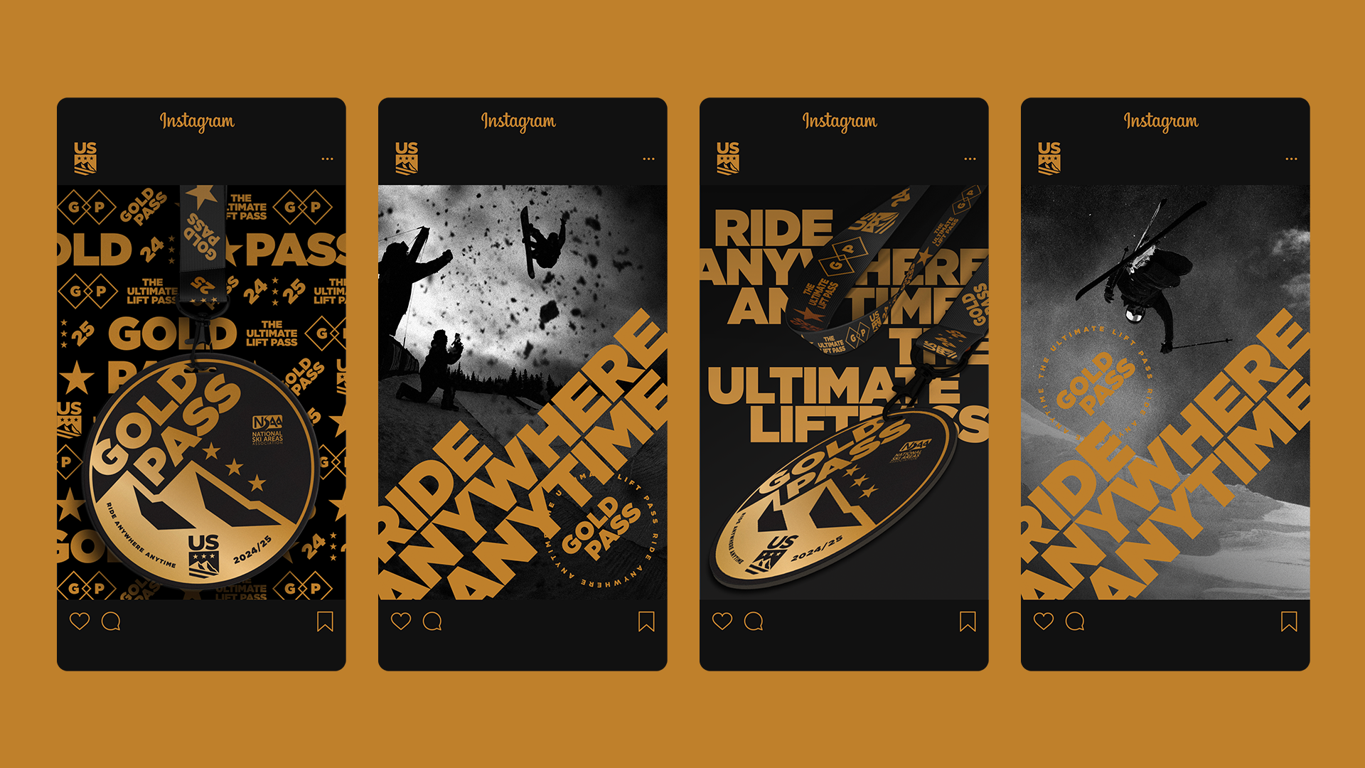
Redesigning the Gold Pass visual identity system with a bold new look.
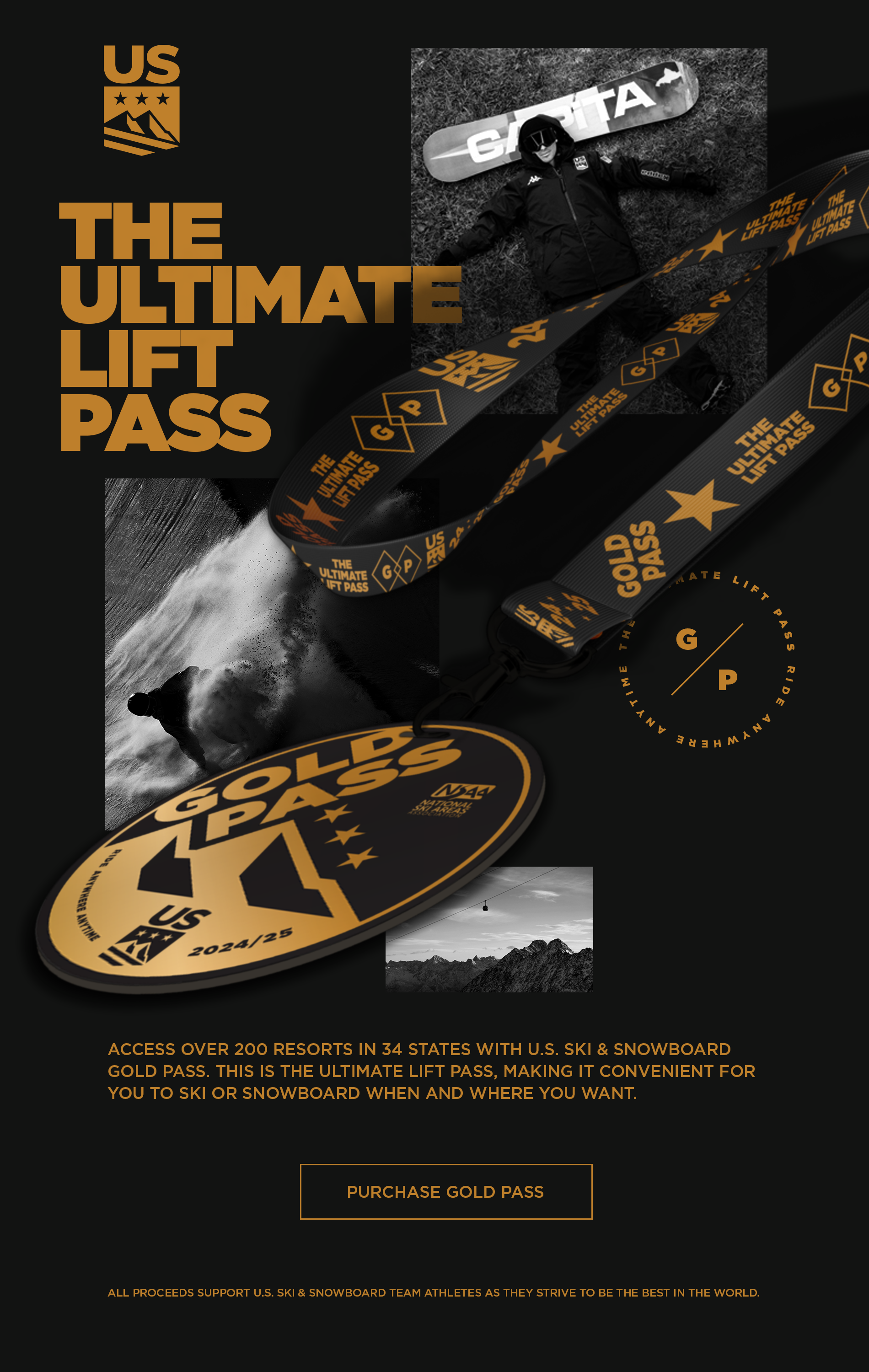
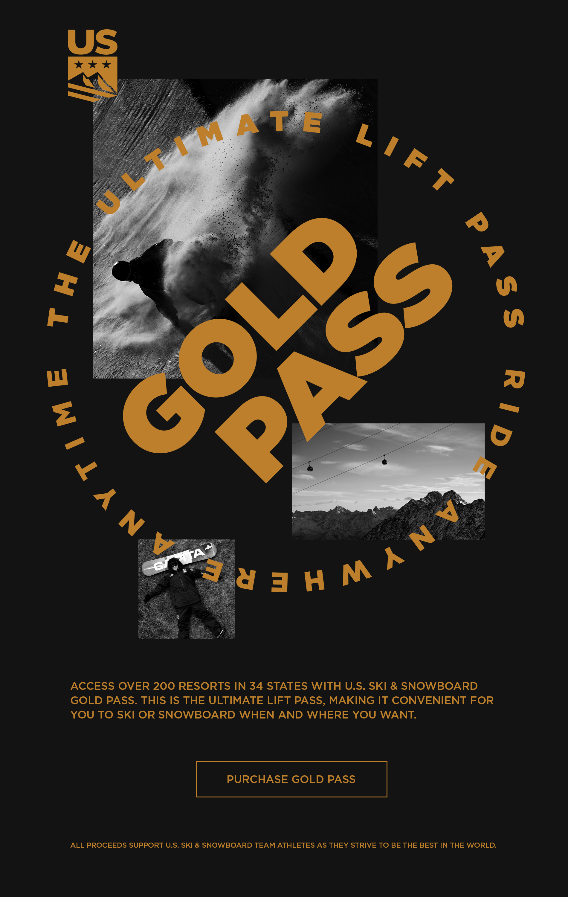
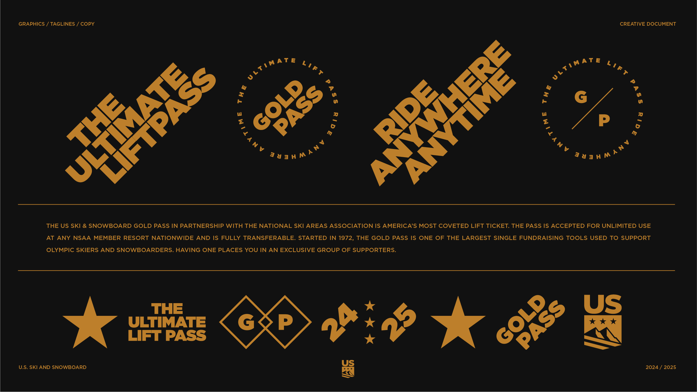
OVERVIEWThe U.S. Ski & Snowboard Gold Pass is the ultimate lift pass—accepted for unlimited use at any NSAA member resort nationwide. Started in 1972, the Gold Pass is one of the largest single fundraising tools used to support Olympic skiers and snowboarders; and having one places you in an exclusive group of supporters.
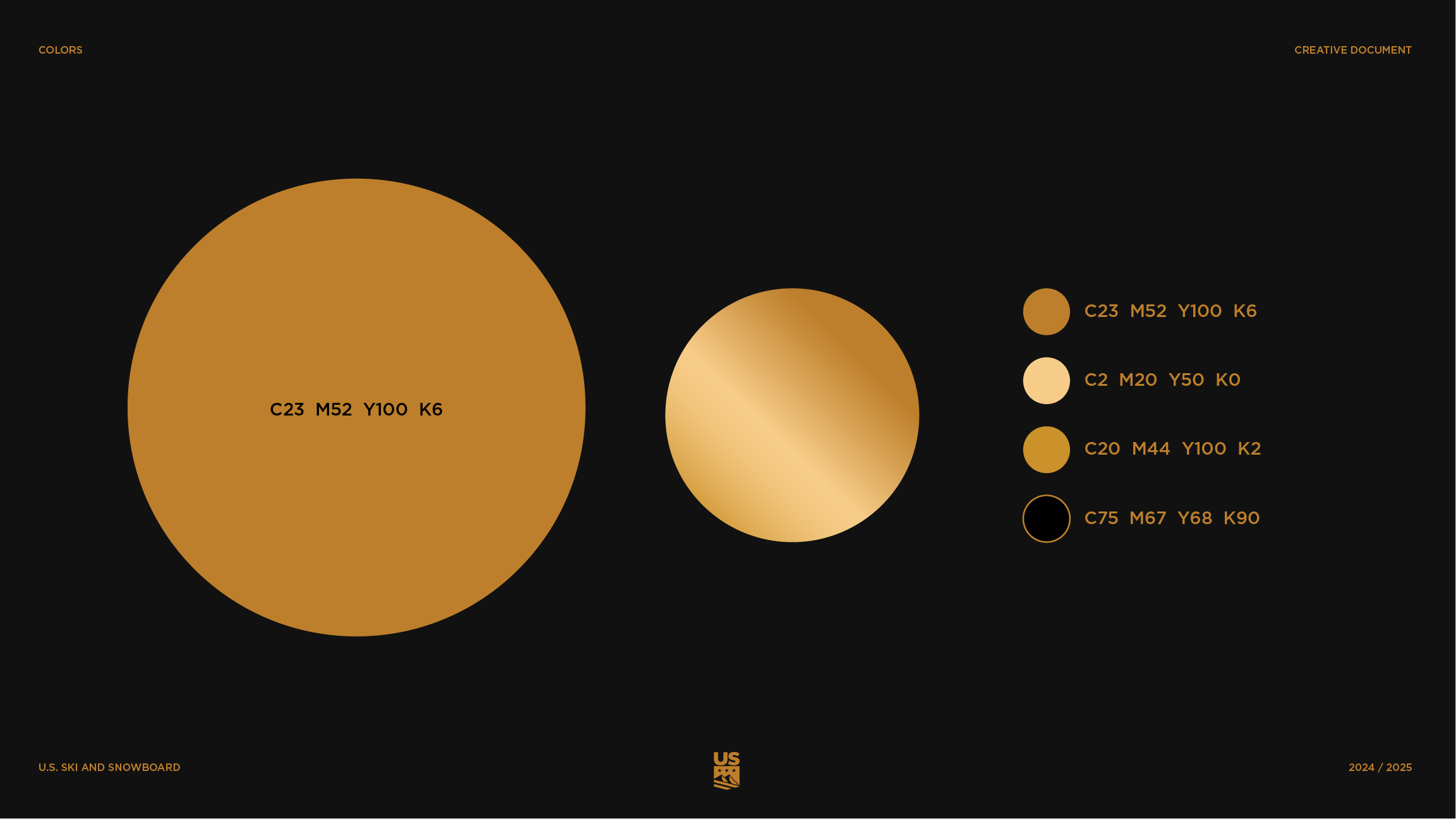
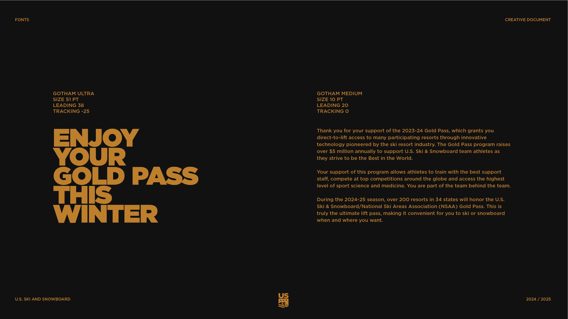
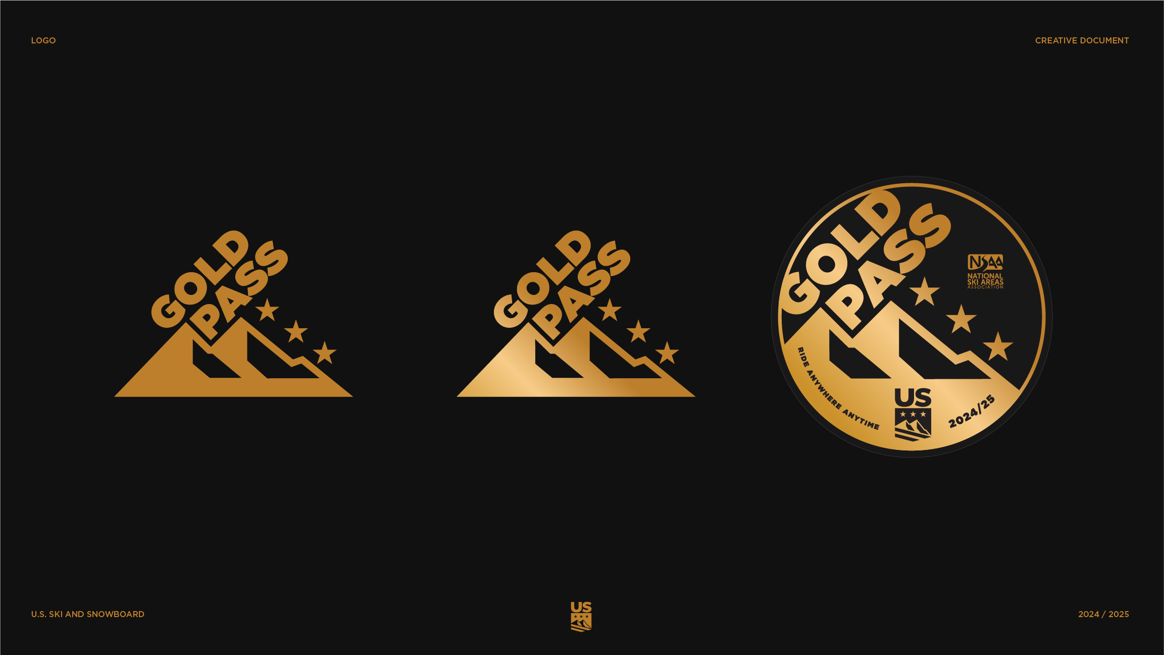
ASSIGNMENTWe focused on creating a premium aesthetic with strong connections to the parent brand. We approached that by leveraging the black and gold— it screams elegance and visually references the gold medals our athletes pursue. The Gold Pass logotype pulled into elements from the U.S. Ski & Snowboard shield, but also introduced new typography systemes that added the boldness and energy of the winter sports categories. This was supported by playful portraits and elite athletic action.


The U.S. Ski & Snowboard Gold Pass is the ultimate lift pass—accepted for unlimited use at any NSAA member resort nationwide.


“As a brand rooted in elite ski and snowboard performance, authenticity is vital.”
JPCG brought a level of sensitivity to the visual identity system that captured our brand's essence, the spirit of winter sports, and an aesthetic that aligns with our target consumer.
Credits
Head of Brand Content
Dave Finger
CD/Designer
Jason Penning